
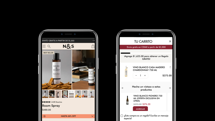
Every year, the same thing happens. Hot Sale approaches, brands define their discounts, prepare their inventory, activate their Meta and Google ad campaigns, and send thousands of visitors to a store that isn't designed to convert them.
The result: high acquisition costs, mediocre conversion rates, and the feeling that "Hot Sale didn't work out as well for us."
The problem is almost never the discount, nor the product. It's almost always the experience due to not implementing e-commerce best practices.
Attracting customers to sell online costs between 15% and 20% more than a year ago, and 75% of entrepreneurs identify new customer conversion as their biggest challenge. In this context, sending expensive traffic to a store with unresolved friction points is like pouring water into a bucket with holes.
At Getmore, we have been working for years with Mexican brands from different industries and stages. And what we have learned is that user experience optimizations, done with time, data, and methodology, are what truly turn Hot Sale traffic into sales.
In this blog, we share 7 real cases of optimizations we made with clients before high-demand seasons: what we detected, what we changed, and why.
How we diagnose what to optimize: the 3-pillar methodology
Before touching a single line of code or changing a single design element, we conduct a diagnosis. We don't work with assumptions; we work with data.
Pillar 1: Metrics and conversion funnel analysis
The three most important metrics for any online store are sessions, average ticket, and conversion rate. Of the three, the conversion rate has the most leverage. And to truly understand it, you have to go down to the funnel:
- How many people add to cart?
- How many of those reach checkout?
- How many complete the purchase?
We compare these numbers against industry benchmarks. This tells us exactly where the user is leaking from the funnel; and that leak is the hypothesis we are going to solve.
Pillar 2: Heat maps with Microsoft Clarity
Numbers tell us where the user leaves. Heat maps tell us why. With Clarity, we can see actual session recordings: where they click, how far they scroll, where they stop, where they leave. It's real behavior, not inference.
Pillar 3: Industry expertise
Data alone is not enough. Knowing what it means and what to do with it requires understanding e-commerce best practices and having solved similar problems before. The combination of the three pillars is what turns a diagnosis into an intervention that truly moves metrics.

The overarching principle: mobile first, always
Before diving into the cases, a principle we apply in each and every one of these optimizations: mobile first, then desktop.
Around 70% of online purchases in Mexico are made from mobile phones, and during Hot Sale, that percentage goes even higher; for the brands we work with, more than 90% of event sessions come from mobile.
This means that designing for desktop first and then "adapting" to mobile is not an option. Every optimization described below was designed, tested, and validated first on mobile. Desktop is the second screen, not the first.
The 7 cases
Case 1 - Birdman: Anchored navigation on the product page to reduce informational friction
Industry: Food supplements / vegan nutrition Optimization: Quick navigation tabs + progressive information folds on the product page
Birdman is a brand of organic proteins and supplements with a very specific buyer: someone who researches before buying. They read ingredients, check the nutritional table, look for recipes, compare reviews.
The problem: all that information existed on the product page, but buried in the scroll. The user had to scroll down and down to find what they were looking for, and on mobile, that scroll can be the difference between a sale and a bounce.
What we implemented:
Just below the product header, we added an anchored navigation bar with tabs: Description, Nutritional Table, Recipes, and Reviews. By clicking on any of them, the user goes directly to that section without having to manually search for it.
In addition, we organized the content of each section into progressive information folds: the user first sees the essentials and expands what interests them. They don't feel overwhelmed, but they also don't lack information.
Why it works:
In high-consideration categories like supplements, information is not friction; it's a conversion catalyst. The challenge is not to hide information but to organize it so that it is easy to consume. A user who finds what they are looking for quickly trusts more and buys more.

Case 2 - Balam Denim: Checkout Extensions to reduce abandonment at the most critical moment
Industry: Fashion / denim wear
Optimization: Trust signals + cross-sell within checkout (Shopify Plus)
The checkout is the moment of highest purchase intent in the entire experience, and also the moment where abandonment is highest. The three main reasons why a user does not complete a purchase are: lack of trust, uncertainty about payment methods, and uncertainty about shipping.
With Balam Denim, as part of the migration process to Shopify Plus, we leveraged Checkout Extensions to address all three directly within the checkout.
What we implemented:
- Contextual trust signals: Banners with free shipping, satisfaction guarantee, number of satisfied customers, and direct access to WhatsApp to answer questions in real time: all chosen based on the actual frequently asked questions they receive as a brand
- Visible payment methods: Visa, Mastercard, American Express, Mercado Pago, and Kueski, without the user having to reach the final step to know if their method works
- Cross-sell with Rebuy: Low-cost, low-decision-friction products directly in the checkout: a branded thermos for $359 pesos and a basic blouse for $179 pesos
The logic of cross-selling at checkout is the same as candy next to the Oxxo cashier: these are products that the user can add almost without thinking, without breaking their purchase flow. The average ticket goes up without the customer feeling like they are being sold something.
Important note: Checkout Extensions are an exclusive feature of Shopify Plus. It is one of the most concrete reasons why scaling brands make the migration.

Case 3 - Gravel: Trust signals on the collection page, the largely forgotten one
Industry: Bicycles / high-ticket ($7,000–$10,000+ pesos)
Optimization: Block of trust attributes on the collection page
The collection page is, in many cases, the landing page for Meta and Instagram ads. The user sees an ad, clicks, and arrives there, not on the homepage, not on the product page. However, it is the page that receives the least attention in terms of optimization.
With Gravel, we detected through heat maps that users arriving from ads bounced quickly. The reason: they arrived at a page that visually presented the catalog but did not answer the immediate questions of someone considering buying a $9,000 peso bicycle.
What we implemented:
A block of trust signals co-designed with the brand, directly on the collection page:
- 30 days for returns: the most common question in a high-ticket purchase
- Shipping in 24 hours: a real competitive differentiator
- Free shipping: eliminates a financial objection
- Lifetime warranty: the most powerful argument for a purchase of this level
We didn't choose the attributes; the brand chose them based on what their customers ask. We organized them and placed them where the user needed to see them.
The logic applied to Hot Sale:
During the event, when a brand runs ads and sends massive traffic to its collection, each user arrives comparing options in real time. Trust signals on that page can be the factor that retains them and leads them to explore the catalog instead of bouncing to the competition.

Case 4 - La Castellana: The upgrade of the smart cart they already had
Industry: Wines and spirits / frequent purchase + gift
Optimization: Redesign and update of smart cart rules with Rebuy
La Castellana already used Rebuy. They had a functioning smart cart. But "functioning" doesn't always mean "functioning well," and in high-traffic seasons, the difference between a mediocre smart cart and a well-configured one can represent several percentage points in average ticket.
What we detected:
The existing smart cart had outdated product rules, the recommendations didn't always make sense with what the user had in their cart, and the design wasn't up to the premium experience that La Castellana wants to convey.
What we implemented:
Complete redesign of the smart cart with a visually cleaner and more fluid experience, more consistent with the brand's identity. And a deep update of the recommendation rules so that suggested products were more relevant and easier to add at the moment.
The point worth emphasizing:
Many Shopify stores believe that because they redesigned their store two or three years ago, it's already good to go. It doesn't work that way. An online store is more like a car than a building: it requires constant maintenance, updates, and adjustments to perform well. Tools evolve, user behavior changes, and industry best practices move fast. What was sufficient in 2022 might be hindering your sales today.

Case 5 - Mandala: The first fold of the product page, where the sale is won or lost
Industry: Perfumery / dupes of premium brands
Optimization: Complete redesign of the first fold of the product page
There is a very common misunderstanding in e-commerce: that the homepage is the most important page in the store. In reality, in most cases, the product page is the most important, and within it, the first fold is where the purchase is decided.
The first fold is what the user sees without scrolling. If that area doesn't answer their most immediate questions and doesn't incentivize them to buy, the rest of the page matters very little.
Mandala sells perfumes inspired by luxury brands: a product that the user cannot smell on screen. This means that all the information that would normally be conveyed through the senses must be communicated visually. The first fold has to work twice as hard.
What we implemented:
A 100% custom redesign of the first fold with element hierarchy designed for this specific product:
- Gender badge (Women / Unisex / Men): immediate, frictionless segmentation
- Scent intensity bar: brand-managed, answers the most specific question of someone buying perfume without smelling it
- Brand trust signals: processing time, shipping, money-back guarantee
- Visible payment methods (MSI, KueskiPay, Aplazo): reduces financial friction before the user reaches checkout
- Volume discount: visible cart incentive from the first moment
- Custom Packs banner: contextual cross-sell without leaving the fold
The 7 elements that must be in the first fold of every product page:
- Product name
- Brief description
- Image gallery
- Reviews (stars and number)
- Price (with visible discount if applicable)
- Trust signals: shipping, returns, payment methods
- Add to cart button: prominent, without visual competition
On desktop, all of this should fit without scrolling. On mobile, it should be ordered by decision hierarchy, as high as possible, without causing visual fatigue.

Case 6 - Nook & Scent: Subscriptions at the Right Time
Industry: Aromatherapy / home - naturally repurchaseable consumable product Optimization: Implementing subscriptions on the product page
Subscriptions are not for all brands at all stages. They work when two conditions are met: the product is consumed and needs to be replenished, and the brand already has evidence that its customers return to buy it.
Nook & Scent meets both. Their Room Spray is a product that runs out: if the customer uses it at home, they will inevitably need another one. And they have a proven high repurchase rate. That was the right time to implement subscriptions.
What we implemented:
A toggle on the product page with two options: One-time purchase at regular price vs. Subscribe and save 25% OFF. The subscription presentation includes its explicit benefits, pause anytime, change delivery date, modify your products, to neutralize the most common objections that prevent the user from committing.
Why Hot Sale is the ideal time to activate or boost subscriptions:
During the event, the user's purchase intent is at its highest. The emotional cost of committing to a subscription is lower than on a normal day: the customer is already in "buying" mode, and adding the subscription feels like an advantage, not an obligation.
Furthermore, a customer who subscribes during Hot Sale not only generates a sale: they generate predictable recurring revenue that improves long-term profitability. As we have explained in our blog on how to get more repeat customers, the second purchase is the most important milestone in a customer's life; and a subscription guarantees it.

Case 7 - Spring Air: The Smart Search Engine That Recovers Lost Demand
Industry: Mattresses / high ticket
Optimization: Personalized search engine with synonyms and contextual messages on Shopify Search & Discovery
This is one of the most technical cases and one of the ones that can have the most impact for brands that sell through multiple channels.
The problem:
Spring Air sells its products both on its own e-commerce and in department stores like Liverpool and Palacio de Hierro. The problem: the same mattress has different names depending on the channel. At Liverpool it's called "Godiva." On the Spring Air website it's called "Lum."
Through heatmaps, we detected that internal search was one of the most used elements of the site, and that many users arrived searching for the name they knew from Liverpool or Palacio. They found no results. They left.
It was real demand, from users with high purchase intent, that was lost due to a naming problem.
What we implemented:
A custom functionality built on Shopify Search & Discovery, extended with additional logic:
- Strategic synonyms: We mapped external names (Liverpool, Palacio, Sears) with the equivalent products in the Spring Air catalog
- Contextual message logic: When the user searches for an external name like "Godiva," the system not only shows products, it displays a specific message: "We couldn't find that model, but we recommend this similar alternative," followed by the equivalent product. The user understands exactly what happened and has a clear path to purchase
- Differentiation between search types: The system distinguishes between a common search ("orthopedic mattress" → normal results) and an external model search ("Godiva" → personalized message + recommendation). This prevents confusing experiences for other users
Why this is especially relevant during Hot Sale:
During the event, users actively search for products they already have in mind, often having seen them in a department store and wanting to buy them during the Hot Sale to take advantage of the price. If your site doesn't recognize them, you lose that sale even if the product exists in your catalog.
The solution also meets a critical requirement for scaling: it is self-manageable and does not require constant development to add new synonyms.

What these 7 cases have in common
Different industries, different problems, different solutions. But there is a common denominator in all of them:
None of these optimizations worked alone. They worked because they came from a real diagnosis.
We didn't install Clarity because it's a good app. We installed it to understand specific behavior. We didn't redesign Mandala's first fold because "it looked bad." We redesigned it because the data told us that was where the purchase decision was made. We didn't customize Spring Air's search engine just because. We did it because heatmaps showed searches with no results that represented lost sales.
Methodology matters as much as execution. And both require time. Time that, if invested before Hot Sale, multiplies when traffic arrives.
If you want to know how these optimizations complement an offer strategy for Hot Sale, we recommend our blog on Hot Sale 2026 strategies for Shopify stores.
Does your store have unresolved frictions?
If you are reading this and recognize any of these problems in your store—users abandoning checkout, product pages that don't convert, no-result searches, outdated smart carts—Hot Sale is not the time to discover them. It's the time when they cost you the most.
At Getmore, we do exactly this: we audit your store, identify where your sales are leaking, and execute the optimizations that move the right metrics. Review how we work and write to us if you'd like us to help you with your specific case.
Frequently asked questions about Shopify store optimization for Hot Sale
How long before Hot Sale should I optimize my Shopify store?
Ideally, you should start diagnosis and optimizations at least 4 to 6 weeks in advance. Some improvements, like adjusting the first fold of the product page or updating trust signals, can be implemented in days. Others, like customizing the search engine or advanced Rebuy configuration, require more development and testing time. It is not advisable to leave optimizations for the week of the event: if something fails during Hot Sale, the cost is much higher.
What is the first fold of a product page and why is it so important?
The first fold is the part of the product page that the user sees without having to scroll: on desktop, what fits on the screen when the page loads; on mobile, the first visible elements. This is the area where the user decides whether or not to buy. If the most important elements (name, price, reviews, trust signals, and purchase button) are not clearly and hierarchically displayed there, the rest of the page matters very little.
What are Shopify Checkout Extensions and what are they for?
Checkout Extensions are customizable blocks that can be added directly within the Shopify checkout process. They allow you to display trust signals, reviews, payment methods, frequently asked questions, cross-sell offers, and direct access to support; all at the moment of highest purchase intent. This functionality is available exclusively on Shopify Plus and is one of the most effective tools for reducing checkout abandonment.
How do I know where in the funnel my customers are leaving?
By analyzing the conversion funnel in Shopify Analytics: how many users add to cart, how many of those reach checkout, and how many complete the purchase. Comparing these percentages against your industry benchmarks will tell you exactly where the leakage is. Complementing this analysis with heatmaps and session recordings (with tools like Microsoft Clarity) tells you why they leave at that specific point.
Is it worth installing subscriptions if I'm still a small brand?
Subscriptions work best when the brand already has evidence of natural repurchase: customers who repeatedly buy the same product. If your repurchase rate is low or your customers are primarily one-time buyers, you need to work on that first. If your product is consumable and you have proven retention, Hot Sale is an excellent time to activate or boost subscriptions.
What is Shopify Search & Discovery and how can it be customized?
Search & Discovery is Shopify's native tool for managing internal search and product recommendations in your store. It allows you to configure synonyms, filters, and the order of results. With additional development, it can be extended with custom logic. As in the case of Spring Air, where a synonym system with contextual messages was created to capture product name searches from other channels.
